Nikoo Samadi
Business Central users need a clear view of their data so they can make simple and confident decisions. One practical way to do this is to look at examples of Power BI dashboards that turn Business Central data into clear visuals. These dashboards show the state of finance, sales, inventory, jobs, or production in one place. They give teams a direct way to understand what is happening and what needs attention.
Many organizations start with built-in reports. These reports often list figures but do not show patterns or changes in context. Power BI fills this gap with dashboards that are easy to read and easy to explore. A dashboard brings the most important indicators to the surface. It also allows users to filter and drill down without technical skills.
This guide explains the most useful Power BI dashboards for Business Central. It covers each dashboard with its key indicators and explains why it matters. It also includes best practices that help teams build dashboards that stay accurate and simple to use.
Why Power BI Works Well with Business Central
Power BI connects to Business Central without extra tools or complex setup. The connection gives users direct access to tables, pages, and data that they work with each day. This makes reporting simpler and reduces the need for manual exports.
Power BI also turns static Business Central reports into interactive dashboards. Users can filter data, view trends, and drill into details with a few clicks. This helps them move from raw numbers to insight.
Business Central stores data across finance, sales, purchasing, inventory, and jobs. Power BI brings this data together in one place. Teams can compare figures across modules and see how one area affects another. Power BI for Dynamics 365 Business Central gives users a clear connection between their operational data and the dashboards they rely on each day. For example, sales trends can be viewed next to stock levels or cash flow.
Power BI also makes it easier to keep data consistent. When the data in Business Central updates, the dashboard refreshes as well. This lowers the chance of mistakes and keeps everyone aligned. Because both tools come from Microsoft, the design, security, and access control work in a familiar way. This allows organizations to adopt dashboards without major training or change.
If you want to learn more about Power BI integration, read here.
Simplify Your Decision with GEM365
Get in touch with GEM365 to guide you through the process and get consultation for free.
Examples of Power BI Dashboards for Business Central
Power BI offers many ways to view Business Central data, but some dashboards provide more value than others. The following sections show clear examples of Power BI dashboards that fit common needs in finance, sales, purchasing, inventory, jobs, and production. These Power BI dashboards for Business Central give users a direct view of the indicators that matter each day. Each dashboard includes key indicators and a short explanation of how it supports real work. These are essential Power BI dashboards that help organizations focus on the indicators that matter most.
Financial Dashboard: Revenue, Cash Flow, Budget vs Actual
A Financial Dashboard is one of the most used Business Central Power BI dashboards. It brings the main financial indicators into one view. It shows how money comes in, how it leaves, and how the organization performs against its plan.
Revenue and expense trends show if the organization is on track. Cash flow shows if the business can meet its short-term needs. Budget vs. actual helps managers see if spending follows the plan. Margin figures point to the strength of operations.
This dashboard helps finance teams review the state of the business without moving across multiple pages. It also gives managers a simple way to review financial health during planning or monthly close. When used with Business Central’s Financial Overview data, it helps users move from a long list of transactions to a clear picture of performance.
Key indicators:
- Revenue
- Expenses
- Cash flow
- Budget vs actual
- Gross margin
- Operating margin
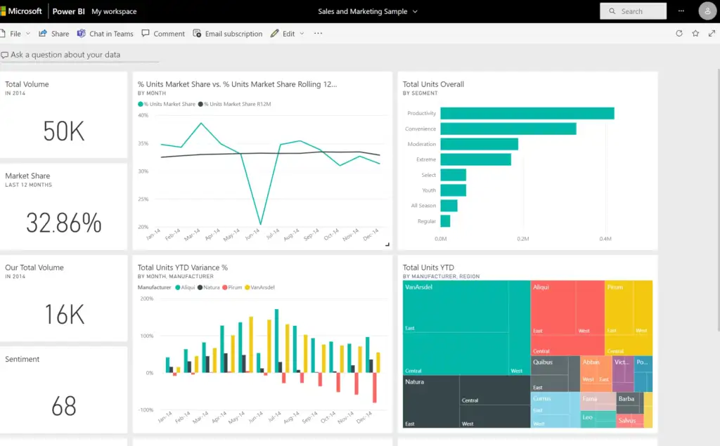
Sales and Revenue Dashboard: Sales by Customer, Item, and Period
A Sales and Revenue Dashboard gives teams a clear view of demand and customer activity. It is one of the most practical Power BI dashboards for Business Central because sales data sits at the center of daily decisions. This dashboard turns scattered sales lines, customer entries, and item records into a simple picture of performance.
Total sales show the current state of demand. Breakdowns by item and customer reveal where revenue comes from and where it drops. Trends by period help teams see changes in buying patterns. Lead, quote, and order figures show movement through the sales cycle. Win rate shows how many opportunities turn into closed sales.
This dashboard supports both sales teams and managers. It helps them track progress, prepare for reviews, and plan stock or production when needed. When connected to Business Central data, it keeps the sales pipeline and order history in one clear view.
Key indicators:
- Total sales
- Sales by item
- Sales by customer
- Leads, quotes, and orders
- Win rate
- Sales trends by period
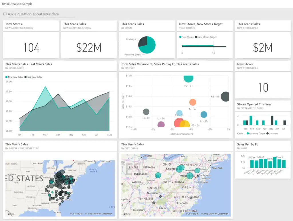
Inventory and Warehouse Dashboard: Stock Levels, Value, and Movement
An Inventory and Warehouse Dashboard gives teams a clear view of stock across locations. It is one of the most useful examples of Power BI dashboards for organizations that handle goods. Business Central holds detailed item and ledger data, and Power BI turns this data into a view that is easy to read.
Stock levels show what is available right now. Stock value shows how much money sits in inventory. Slow-moving and fast-moving items highlight demand patterns and help reduce waste. Stock turnover shows how often items sell and replenish. Reorder points show when an item needs attention so that shortages do not occur.
This dashboard helps warehouse staff, planners, buyers, and managers stay aligned. It reduces the need to check multiple screens or run repeated reports inside Business Central. When updated through Power BI, it gives a simple and real-time view of inventory health.
Key indicators:
- Stock levels
- Stock value
- Slow-moving items
- Fast-moving items
- Stock turnover
- Reorder points
Purchasing Dashboard: Orders, Delivery Time, and Supplier Performance
A purchasing dashboard helps teams track how goods move from suppliers into the organization. It is a practical Power BI dashboard for Business Central because purchasing data sits across several pages and can be difficult to review in one place. Power BI brings this information together so buyers and managers can see the state of procurement at a glance.
Open purchase orders show what is on the way. Delivery time shows how long suppliers take to deliver goods. Supplier performance highlights delays, shortages, or partial deliveries. Expected receipts help warehouse teams plan space and staff. Cost variance shows differences between quoted and actual costs.
This dashboard supports better planning and more accurate decisions. It helps organizations monitor suppliers, prepare for delays, and control costs. When connected to Business Central’s purchasing tables, it removes guesswork and provides a clear view of the full purchasing cycle.
Key indicators:
- Open purchase orders
- Supplier performance
- Delivery time
- Expected receipts
- Cost variance
Manufacturing and Production Dashboard: Capacity, Output, and Work Centers
A manufacturing and production dashboard helps teams see how well production runs each day. It is one of the most valuable Business Central Power BI dashboards for organizations that use the Manufacturing module. Business Central holds detailed data on work centers, machine centers, routing steps, and production orders. Power BI turns this data into a view that makes it easier to track progress.
Work center load shows how much work sits in each area. Machine utilization shows how often machines run and where idle time appears. Production order status gives a simple overview of orders that are released, in progress, or finished. Output vs plan shows if the shop floor meets targets. Scrap highlights issues that affect cost and quality.
This dashboard helps planners, supervisors, and managers resolve problems early. It supports better scheduling, reduces bottlenecks, and keeps production aligned with sales and inventory needs. When connected to Business Central, it removes the need to check multiple screens and gives a single, clear view of production health.
Key indicators:
- Work center load
- Machine utilization
- Production order status
- Output vs plan
- Scrap
Project/Job Costing Dashboard: Profitability, WIP, and Resource Usage
A project or job costing dashboard helps teams track the financial state of ongoing work. It is one of the most useful examples of Power BI dashboards for companies that run service projects, construction jobs, or long-term work orders. Business Central stores detailed job data, but it often sits across several cards, ledgers, and pages. Power BI brings this information together in one clear view.
Job profitability shows if a project earns money or loses money. Actual cost vs budget highlights overrun early. Resource usage shows how labor and equipment are used on each job. WIP shows how much value sits in unfinished work. Billed vs. unbilled work helps teams plan invoices and manage cash flow.
This dashboard supports project managers, accountants, and leadership. It gives a simple way to review project health and act before issues grow. When connected to Business Central, it removes the need to check many reports and provides a direct view of costs and progress.
Key indicators:
- Job profitability
- Actual cost vs budget
- Resource usage
- Work in progress (WIP)
- Billed vs unbilled work
Executive KPI Dashboard: Cross-Department Summary
An executive KPI dashboard gives leaders a clear and simple view of the entire organization. It brings together data from finance, sales, inventory, projects, and production. This makes it one of the most complete Power BI dashboards for Business Central, because it relies on several areas of the system at once.
Revenue and margin show overall financial strength. Sales performance highlights changes in demand. Cash position shows the ability to meet short-term needs. Inventory status points to stock levels and risks. The production summary shows if operations meet the plan.
Executives use this dashboard to understand the current state of the business without moving through many reports. It supports planning, reviews, and regular decision-making. When connected to Business Central data, it creates a simple view that reflects real conditions across departments.
Key indicators:
- Revenue
- Gross margin
- Sales performance
- Cash position
- Inventory status
- Production summary
Best Practices for Building Power BI Dashboards for Business Central
Power BI works well with Business Central, but the quality of a dashboard depends on how it is built. Good design and good data structure make a dashboard easier to use and easier to trust. The following practices help teams create dashboards that stay clear, fast, and accurate.
Start With One Purpose
Every dashboard should serve one goal. A dashboard that mixes unrelated topics becomes hard to read. Choose a single area such as finance, sales, or inventory. Then pick the indicators that support that goal. This keeps the view clean and helps users find what they need without effort.
Use a Clean Data Model
A clean data model improves speed and accuracy. Power BI works best when data follows a star schema. This means one fact table connects to several dimension tables. Avoid complex links, loops, or many-to-many connections. Shape and clean data before creating visuals. Good modeling reduces mistakes and makes the dashboard easier to maintain.
Keep Visuals Simple
A dashboard works when users understand it in seconds. Use a simple layout and limit the number of visuals. Label each chart clearly. Use consistent colors for similar measures. Include filters and drill-down options so users can explore details when they need them. A clear design supports better decisions.
Maintain Performance
Large datasets and heavy visuals can slow a dashboard. Limit the number of charts. Avoid complex or unnecessary DAX formulas. Use import mode where possible, and enable scheduled refresh so data stays current. Test refresh times to ensure the dashboard loads quickly for all users.
Apply Security Controls
Business Central often holds sensitive data. Power BI should protect this data through clear security controls. Use row-level security to limit access to specific records. Create clean workspace structures so users only see dashboards meant for them. Use clear naming and version control to keep reports organized.
How Business Central Users Can Get Started
Creating a Power BI dashboard for Business Central does not require a complex setup. Most organizations start with one area where reporting feels slow or unclear. The steps below offer a simple way to begin and build momentum.
Choose One Reporting Need
Start by selecting a single area such as finance, sales, or inventory. Pick a problem that affects daily work. This keeps the first dashboard focused and easier to finish. A small, clear start builds confidence and helps users adopt the dashboard quickly.
Connect Power BI Desktop to Business Central
Open Power BI Desktop and choose the Business Central connector. Sign in with your account. Select the environment and company. Then choose the tables you need. For example, sales data often comes from Customer Ledger Entry, Sales Line, or Item tables. Inventory data often comes from Item Ledger Entry or Value Entry.
Shape and Prepare the Data
Review the imported tables. Remove fields you do not need. Rename columns so they are clear. Create relationships that follow a star schema. Clean data before building visuals. This reduces confusion and keeps the dashboard simple to maintain.
Build the First View
Create a page with a small set of indicators. Use clear charts and simple text cards. Add slicers for date, customer, or item when needed. Test the dashboard with a few users. Ask if the view answers their main questions. Adjust the layout based on their feedback.
Publish and Share
Publish the dashboard to the Power BI service. Set a refresh schedule so the data stays current. Share it with the teams that need it. If needed, embed the dashboard in a Business Central Role Center. This keeps the view close to daily work and increases adoption.
Final thoughts
Power BI helps Business Central users see their data in a clear and organized way. The dashboards in this guide show practical examples of how teams can track finance, sales, inventory, projects, and production without moving through many reports. Each dashboard turns detailed records into simple indicators that support daily decisions.
Strong dashboards come from a clear purpose, a clean data model, and a simple design. When these elements work together, users get views that stay accurate, load fast, and remain easy to understand. Starting with one area and growing from there helps teams adopt dashboards at a steady pace.
By using these examples of Power BI dashboards, organizations can build reporting that supports planning, reduces guesswork, and keeps everyone aligned. Business Central provides the data. Power BI makes that data clear.
Table of Contents
Read more
- Top Dynamics 365 Sales Features: Transform Sales Performance
- Microsoft 365 vs Office 365: Key Differences Explained
- Business Central Cloud vs On Premises: Which to Choose
- Forbes Reveals the Best Cloud ERP: Here’s Why Business Central Wins
- How the Microsoft Power Apps Platform Transforms Manual Processes

Top Dynamics 365 Sales Features: Transform Sales Performance


Forbes Reveals the Best Cloud ERP: Here’s Why Business Central Wins

How the Microsoft Power Apps Platform Transforms Manual Processes